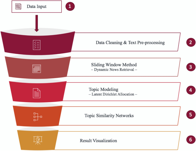
After the standard text cleaning process, lemmatisation, and the removal of repeated phrases, news articles were sliced by a sliding window of 7 days with a stride of 1 day for dynamic news retrieval to obtain \(M_t\) documents at time t. Each segment of the \(M_t\) documents was semantically analysed using the Latent Dirichlet Allocation (LDA) model, with the number of topics being set to \(K=80\)50. These topics, each represented by words in the corpus and their respective topic-word probability matrices, \(\beta _{t}\), served as the input to form DTNs. We used the similarity between \(\beta _{it}\) and \(\beta _{jt}\) to investigate the topological features of the financial news over time, where \(\beta _{it}\) is the i-th topic’s word distribution at time t. The topological features were summarised using network statistics which can provide insights on financial market evolution, market variation, and systemic risk in financial markets. More detailed description of the construction of the DTNs can be found in the “Methods” section. The results are presented and visualised in the following subsections.
Visualisation of dynamic topic networks
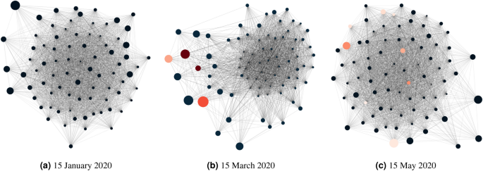
To explore the network structures of latent topics from financial news, we present network diagrams where network nodes represent latent topics and edges are formed by the similarity of \(\beta _{it}\) among 80 topics. As an illustration, Fig. 2 shows three network structures at different dates, where Fig. 2a–c represent the fifteenth day of January, March, and May 2020, respectively. The first date is before the WHO declared COVID-19 a pandemic on 11 March 2020, and the last two dates are after the announcement. In the figures, each node represents a topic, whose importance is reflected by its node size, proportional to the number of words generated by the topic across the entire corpus or proportional to the topic probabilities in \(\theta _t\). If the topic contains the word coronavirus, its within-topic frequency percentage is obtained from \(\beta _{it}\) and represented by the red gradient according to the percentage.
Network graphs at three different dates. Node size represents topic importance, which is proportional to the number the tokens generated by the topic across the whole corpus. For example, a size of 0.2 represents that an estimated 20% of tokens was covered by the chosen topic i. If the topic is coronavirus-related, its node will be represented by a red gradient, whose colour is mapped to the range between 0 and 0.1 according to the word-topic probability for coronavirus in \(\beta _{it}\).
In Fig. 2a, which shows the topic network on 15 January 2020, it is observed that topics were generally highly connected, without any main deviation of nodes from the main cluster. At this time, the pandemic was not an influential subject, therefore we do not see an influence of COVID-19 on any topics and all nodes are of the same colour. Figure 2b for the topic network on 15 March 2020, on the other hand, shows that the network structure was comparatively less connected and some important topics (with big node sizes) were noticeably farther away from the main cluster. This is not surprising as the nodes with different colours suggest that these topics are coronavirus related. With the emergence of this new pandemic-related word and the sudden growth of its influence on news articles, the network structure was altered from dense networks in January 2020 to networks with multiple small clusters in March 2020, causing a sudden drop in network connectedness, as seen in Fig. 2b. Moving forward to 15 May 2020, we observe in Fig. 2c that the term coronavirus still existed in various topics, but it no longer showed a significant influence in the news articles, as it did in March 2020, but instead was integrated with other terms. We can also see that the coronavirus-related nodes have lighter colours compared to those on 15 March 2020, suggesting a much lower influence of the term within topics as well. The network structure as a whole appears similar to that in January 2020 (Fig. 2a).
Network connectedness
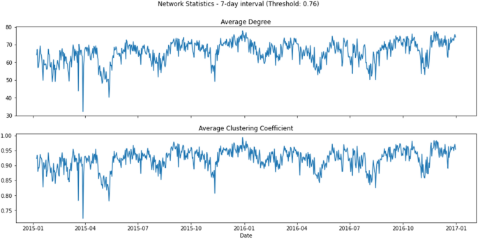
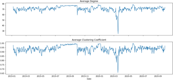
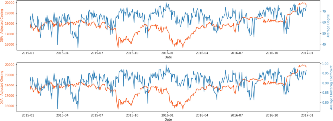
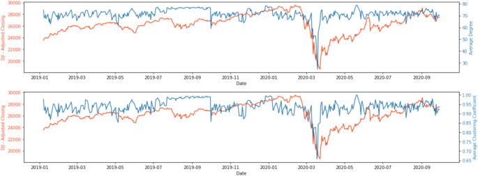
To understand how connected the latent topics were, Figs. 3 and 4 show two network statistics, average degree (\(D_t\)) and average clustering coefficient (\(C_t\)), as presented in the “Methods” section, between 1 January 2015 and 31 December 2016, and 1 January 2019 and 30 September 2020. The average degree, \(D_t\), in the networks measures how many edges (out of 79, excluding itself) on average link to a node. The higher the average degree, the more dense the network at time t will be. Similarly, the average clustering coefficient, \(C_t\), measures how big the clusters formed by neighbourhoods of a node of the network are on average at time t. In our context, both \(D_t\) and \(C_t\) measure the level of connectedness of the topic network at time t.
In Fig. 3, the connectedness reached the lowest around late March 2015, with the lowest points 20 March (\(D_t\) = 43.8, \(C_t\) = 0.783) and 28 March (\(D_t\) = 32.125, average \(C_t\) = 0.723). After around a month of resuming to the normal level, the connectedness began to go downhill again in late April/early May 2015 and reached another local minimum on 12 May (\(D_t\) = 40.25, \(C_t\) = 0.781). Moving forward, the connectedness reached yet again another local minimum in mid-November, and the drop was in particular obvious for the \(C_t\) (\(D_t\) = 49.175, \(C_t\) = 0.807). There were also some moderately low points in late April/early May, early August and early November in 2016.
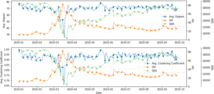
As observed in Fig. 4, topics were highly connected (with \(D_t\) of around 70) at all time t except for March 2020. The two network statistics, \(D_t\) and \(C_t\), began to show a downward trend on 10 March 2020, and the trend continued until the statistics reached the lowest point on 18 March 2020 for average clustering coefficient, (\(C_t\) = 0.657) and on 19 March 2020 for average degree (\(D_t\) = 24.475). An interesting phenomenon is that \(D_t\) and \(C_t\) rebounded quickly to “normal levels” after a sharp drop in mid-March 2020. This structural change in topic network connectedness in March 2020 indicates that semantic features summarised by the DTNs constructed by financial news may give us insights into how financial markets react to unexpected events or even catastrophes. Therefore, studying the relationship between these DTNs and financial market movement may provide systemic risk implications from financial news.
Given the results from the network statistics, we try to understand what the topics were at several time points in the pre-pandemic period, the period when the network statistics started to drop to a low value, and the period when the network statistics returned to a normal level. The fifteenth day of January, March, May, and July 2020 were studied, and the top 30 most salient words are shown in Table 1. A majority of the words are finance related, and some of these words, such as share, target, and rating, are in the list of the most salient words in all four randomly selected dates. One interesting finding was that the word coronavirus, which was not the most salient word on other dates, topped the ranking on 15 March 2020, a few days after the WHO declared COVID-19 a global pandemic.
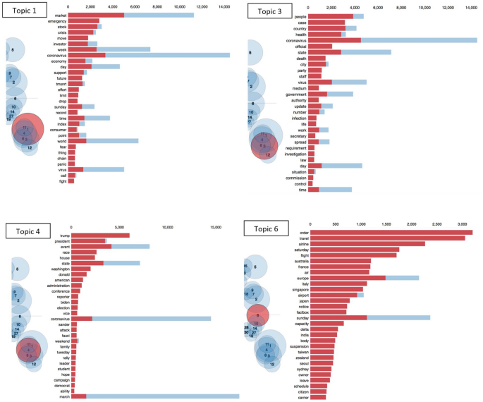
As mentioned, the word coronavirus was one of the most significant words on 15 March 2020, and thus we show the top four most important COVID-19 related topics on that date in Fig. 5 to understand the underlying word distribution for topic i, i.e. \(\beta _{it}\). The four topics are topics 1, 3, 4, and 6, where the first three topics contain the word coronavirus as a major word and topic 6 contains travel and flight as major words. Topics are represented by bubbles, whose sizes are proportional to their importance and which are clustered together on the basis of their similarities. The four topics, 1, 3, 4, and 6 are highlighted by red bubbles in four diagrams. We can see that coronavirus had a significant importance for the selected news period (9–15 March 2020). Also, it comes as no surprise that the bubbles corresponding to the four most important topics are close to each other, indicating a relatively higher across-topic similarity. Topic 1 is related to the financial market in general and how it reacted to the global pandemic. Topic 3 focuses on the societal perspective and the latest development of the virus. Topic 4, on the other hand, links the pandemic to politics in the United States, and Topic 6 shows how coronavirus was affecting the world and the travel industry. The above topic characteristics explain why the connectedness of the topic network can be particularly low when COVID-19, as an emerging global event, tended to have a big influence on financial news.
Relationships with financial indices
We chose to relate our dynamic topic network statistics to two indices: (1) DJIA: Composed of the 30 largest stocks listed on the U.S. stock exchanges, the DJIA is a good representative of U.S. stock market performance; (2) VIX: This is a derived index from S&P 500; it is widely used by investors and financial institutions to measure market risk and stability and is a good proxy for systemic risk in financial markets.
A comparison of the network statistics with the VIX and DJIA gave us some interesting results. Figures 6 and 7 display the network statistics and the DJIA in the same graph. It can be seen that the topic network statistics, \(D_t\) and \(C_t\), showed two main drops around April/May and November 2015, several months before the drops of DJIA in September 2015 and January 2016, respectively and a general downward trend that aligned with the DJIA in March 2020. During the COVID-19 pandemic, the two network statistics took a sudden dip for a few days and then quickly rebounded to their original levels and became stationary again, whereas the DJIA reached the lowest point of 18,591.93 on 23 March 2020 before gradually recovering to its original level.
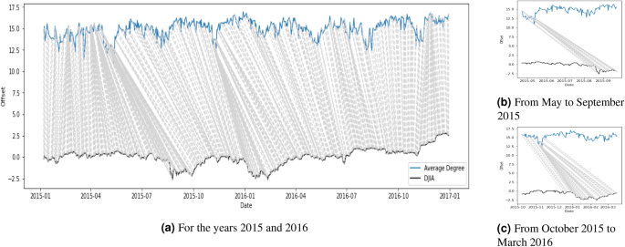
Given the patterns in Figs. 6 and 7, one might be curious to see if there is any correlation or lead-lag relationship between the time series of the network statistics and the DJIA. Since we were also interested in whether one series was ahead of another, we needed a way to quantify the synchrony between the two series. We adopted the dynamic time warping (DTW) algorithm51 to detect the leader-follower interaction. Specifically, we used the DTW algorithm to evaluate the similarity between network statistics and DJIA. It starts with the first time step of the query series and calculates its distance with all data points on the reference series. Then it moves to the second time step of the query series and it repeats the same calculation until the last time step. The best alignment between the two series is found by getting the minimum warping path using the calculations. Figures 8 and 9 show the point-by-point comparison between the average degree, \(D_t\), and the DJIA for the years 2015–2016 and 2020 respectively. The grey lines connect the two series on the basis of the shortest Euclidean distance with the implementation of an asymmetric step pattern51. In terms of the major events, Fig. 8b,c show that the downturns of average degree in May and November 2015 correspond to the low points of DJIA in early September 2015 and January 2016. Some moderate fluctuations also occurred in 2016, but the similarity relationship was not very obvious. In Fig. 9b, when the average degree dropped to the lowest point on 18 March 2020 and began the pick up to the original level, it provided an indication that the DJIA would also gradually start to pick up in the upcoming months. The direction of the grey lines before 18 March 2020 seems to tell us that the average degree reacted faster than the DJIA. After 18 March 2020, the grey lines showing the same direction as just before 18 March 2020 are even steeper and show stronger evidence that the average degree “led” the DJIA to return to normal levels. The responsive nature of the network statistics potentially provides insights for academics, investors, and financial institutions on when the market would start to recover after an unprecedented event, such as the COVID-19 pandemic investigated in this study.
Figure 10 shows another comparison between the average degree of the topic networks, VIX, and DJIA in 2020. These three series experienced an unusual movement during the pandemic period in February and March 2020. VIX showed an increasing trend starting in late February 2020, while the DJIA exhibited a substantial drop at a similar time until it reached its lowest point of 18591.93 on 23 March 2020. The two topic network statistics, \(D_t\) and \(C_t\), started to show a drastic decrease in early March, dropping to their lowest value on 18 March 2020 before responsively returning to their original value a few days later.

